
Web Designers: Understanding the clamp() Function in CSS
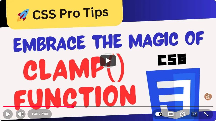
Understanding the clamp() Function in CSS
As a web designer, mastering CSS is essential for creating responsive and visually appealing websites. One of the most powerful features introduced in CSS is the clamp() function. In this blog post, we'll explore what the clamp() function is, how to use it, and practical examples to enhance your web design.
What is the clamp() Function?
The clamp() function in CSS allows you to set a value that can adapt to different screen sizes while adhering to defined constraints. It accepts three parameters:
clamp(minimum, preferred, maximum)
- minimum: The smallest value the property can take.
- preferred: The ideal value that the property will take, often calculated based on viewport size or other factors.
- maximum: The largest value the property can take.
This function is particularly useful for responsive design, where you want to ensure that your layout looks good across a variety of device sizes.
Why Use clamp()?
Using clamp() provides several advantages:
- Responsiveness: It allows for fluid resizing of elements, ensuring that they look great on all devices.
- Simplicity: Instead of writing multiple media queries to handle different screen sizes, you can manage everything in one line of code.
- Flexibility: You can define minimum and maximum values to prevent elements from becoming too small or too large.
How to Use clamp()
Basic Example
Let’s start with a simple example of using clamp() to set a responsive font size.
h1 {
    font-size: clamp(1.5rem, 2vw + 1rem, 3rem);
}
In this example:
- The font size will never be smaller than
1.5rem. - The preferred size is calculated using
2vw + 1rem, which means it will grow with the viewport width. - The font size will never exceed
3rem.
Implementing with Width
You can also use clamp() with other CSS properties. For instance, you can apply it to a div's width:
.container {
    width: clamp(300px, 50%, 800px);
}
In this case:
- The
.containerwill have a minimum width of300px. - It will expand to
50%of its parent’s width. - It will not exceed
800px.
Practical Applications of clamp()
Responsive Padding
Using clamp() for padding can create a more dynamic layout:
.section {
    padding: clamp(20px, 5vw, 50px);
}
This will ensure that the padding remains consistent and visually appealing across various screen sizes.
Adaptive Images
You can also control image sizes responsively:
img {
    max-width: clamp(300px, 50%, 100%);
}
This ensures images are never too small for the layout while adapting to the viewport width.
Browser Support
As of October 2023, clamp() is widely supported in modern browsers. However, it is always a good idea to check for compatibility in case you need to support older browsers. You can use tools like Can I use to verify support.
Conclusion
The clamp() function is a versatile addition to your CSS toolkit. It simplifies responsive design by allowing you to set flexible values for properties while ensuring they stay within defined limits. With the use of clamp(), you can enhance your web designs, making them more adaptive to different screen sizes and ensuring a consistent user experience.
Start experimenting with the clamp() function in your next project, and see how it can streamline your CSS and improve responsiveness with ease!
Connect with SkillBakery Studios
Explore more tutorials, tools, and resources:
Posted by SkillBakery Studios


 Hello, my name is Jack Sparrow. I'm a 50 year old self-employed Pirate from the Caribbean.
No comments:
Post a Comment