
Web Developers : 6-Craft a Basic and Reusable React Component
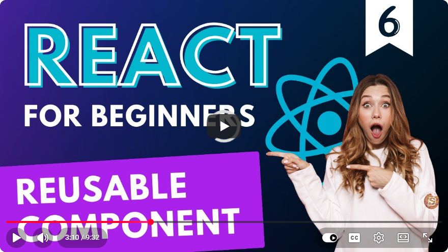
Crafting a Basic and Reusable React Component
In the world of web development, React has become a go-to library for building user interfaces. Its component-based architecture allows developers to create reusable components that can enhance productivity and maintainability. In this tutorial, we’ll walk through the process of crafting a basic and reusable React component, exploring key concepts and best practices along the way.
What are React Components?
React components are the building blocks of any React application. They can be thought of as custom, reusable HTML elements, each encapsulating its own logic and rendering. Components can be classified into two main types:
- Functional Components: These are stateless components defined as JavaScript functions.
- Class Components: These are stateful components defined as ES6 classes.
For this tutorial, we’ll focus on functional components, leveraging React hooks for state management.
Setting Up Your React Environment
Before we dive into creating our component, ensure you have a React environment set up. If you haven’t already done so, you can create a new React app using Create React App:
npx create-react-app my-app
cd my-app
npm start
This will set up a basic React application and launch it in your browser.
Creating a Basic Reusable Component
Let’s create a simple button component that can be reused throughout our application.
Step 1: Define the Component
Create a new file named Button.js in the src directory. Here’s how you can define a basic button component:
// src/Button.js
import React from 'react';

const Button = ({ label, onClick, style }) => {
    return (
        <button onClick={onClick} style={style}>
            {label}
        </button>
    );
};

export default Button;
Explanation
- Props: The
Buttoncomponent accepts three props:label,onClick, andstyle. This makes it flexible and reusable in different contexts. - Event Handling: The
onClickprop allows you to pass a function that will be called when the button is clicked. - Styling: The
styleprop lets you customize the button's appearance directly.
Step 2: Using the Button Component
Now, let’s use the Button component in our main application file (App.js):
// src/App.js
import React from 'react';
import Button from './Button';

const App = () => {
    const handleClick = () => {
        alert('Button clicked!');
    };

    return (
        <div>
            <h1>My React App</h1>
            <Button label="Click Me" onClick={handleClick} style={{ backgroundColor: 'blue', color: 'white' }} />
        </div>
    );
};

export default App;
Explanation
- Event Handler: We define a
handleClickfunction that displays an alert when the button is clicked. - Rendering the Button: The
Buttoncomponent is rendered with its props, demonstrating how to pass data and functionality to our reusable component.
Best Practices for Reusable Components
Creating reusable components is not just about coding; it involves following best practices to ensure they are maintainable and efficient.
1. Keep Components Small and Focused
Each component should ideally do one thing. This makes it easier to manage and test.
2. Use PropTypes
For better maintainability, define prop types for your components using prop-types library:
npm install prop-types
Then, update your Button.js:
import PropTypes from 'prop-types';

// Add this below the Button component
Button.propTypes = {
    label: PropTypes.string.isRequired,
    onClick: PropTypes.func.isRequired,
    style: PropTypes.object,
};
3. Document Your Components
Clear documentation makes it easier for other developers (or even yourself) to understand how to use your components.
4. Avoid Inline Styles
While we used inline styles for simplicity, consider using CSS classes or styled-components for better maintainability and performance.
Conclusion
In this tutorial, we crafted a basic and reusable React component, demonstrating the principles of component-based architecture. We learned about props, event handling, and best practices for building reusable components. By following these guidelines, you can create a library of components that will save you time and improve the quality of your applications.
Feel free to experiment with the Button component and expand on its functionality. Happy coding!
Connect with SkillBakery Studios
Explore more tutorials, tools, and resources:
Posted by SkillBakery Studios


 Hello, my name is Jack Sparrow. I'm a 50 year old self-employed Pirate from the Caribbean.
No comments:
Post a Comment