
Web Developers : Enable External Styling for a Web Component's Shadow DOM
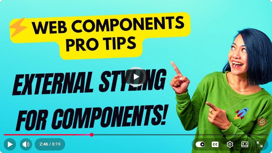
Enabling External Styling for a Web Component's Shadow DOM
Web Components have revolutionized the way we build reusable and encapsulated UI elements. One of the key features of Web Components is the Shadow DOM, which allows developers to create a separate encapsulated DOM for a component. However, styling these components can sometimes be challenging, especially when it comes to applying external styles to a Shadow DOM. In this blog post, we'll explore how to enable external styling for a web component's Shadow DOM.
Understanding Shadow DOM
Before diving into the solution, let's briefly understand what Shadow DOM is. The Shadow DOM is a web standard that allows developers to encapsulate a part of the DOM and CSS styles. This means that styles defined outside of the Shadow DOM do not affect the elements inside it, and vice versa. This encapsulation provides better modularity and prevents style leakage.
Benefits of Shadow DOM
- Encapsulation: Styles and scripts defined in the shadow tree do not affect the main document.
- Reusability: Components can be reused without worrying about conflicting styles.
- Maintenance: Easier to manage styles for complex applications.
The Challenge of External Styling
While encapsulation is beneficial, it can pose challenges when you want to apply external styles to a component's Shadow DOM. By default, the styles defined outside the Shadow DOM won't apply to the elements inside it. This can limit the flexibility of styling your components, especially if you want to maintain a consistent design across your application.
Enabling External Styles for Shadow DOM
To enable external styling for a web component's Shadow DOM, we can employ several strategies. Here are the most common approaches:
1. Using ::part and ::slotted
The ::part and ::slotted pseudo-elements allow you to style elements that are part of the Shadow DOM from outside.
Example Usage of ::part
Here’s how you can use ::part to style a shadow host:
class MyComponent extends HTMLElement {
  constructor() {
    super();
    this.attachShadow({ mode: 'open' });
    this.shadowRoot.innerHTML = `
      <style>
        :host {
          display: block;
          padding: 20px;
          background-color: lightblue;
        }
        ::part(my-button) {
          background-color: coral;
          border: none;
          color: white;
          padding: 10px;
        }
      </style>
      <button part="my-button">Click Me!</button>
    `;
  }
}
customElements.define('my-component', MyComponent);
Styling with ::part in CSS
You can then style the button from your external CSS file:
my-component::part(my-button) {
  background-color: darkorange;
}
2. Using CSS Custom Properties
CSS Custom Properties (variables) provide a powerful way to pass styles into the Shadow DOM. This allows you to maintain a consistent theme across different components.
Example of CSS Variables
class MyComponent extends HTMLElement {
  constructor() {
    super();
    this.attachShadow({ mode: 'open' });
    this.shadowRoot.innerHTML = `
      <style>
        :host {
          --button-bg-color: lightblue;
        }
        button {
          background-color: var(--button-bg-color);
          color: white;
          padding: 10px;
        }
      </style>
      <button>Click Me!</button>
    `;
  }
}
customElements.define('my-component', MyComponent);
Defining Custom Properties Externally
You can then set the custom property from your main CSS:
my-component {
  --button-bg-color: green;
}
3. Using <style> Tags in the Shadow DOM
While this method doesn’t directly enable external styles, you can include <link> tags in the Shadow DOM if you need to pull in external stylesheets.
Example of Including External Styles
class MyComponent extends HTMLElement {
  constructor() {
    super();
    this.attachShadow({ mode: 'open' });
    const link = document.createElement('link');
    link.rel = 'stylesheet';
    link.href = 'styles.css'; // External stylesheet
    this.shadowRoot.appendChild(link);

    this.shadowRoot.innerHTML += `
      <div class="content">Styled Content</div>
    `;
  }
}
customElements.define('my-component', MyComponent);
Conclusion
Enabling external styling for a web component's Shadow DOM can significantly enhance the flexibility and maintainability of your application. By using techniques such as ::part, CSS Custom Properties, and external stylesheets, you can easily manage styles across your components while still taking advantage of the encapsulation benefits of the Shadow DOM.
As you implement these techniques, remember to keep accessibility and performance in mind. Happy coding!
Connect with SkillBakery Studios
Explore more tutorials, tools, and resources:
Posted by SkillBakery Studios


 Hello, my name is Jack Sparrow. I'm a 50 year old self-employed Pirate from the Caribbean.
No comments:
Post a Comment