
WordPress 5.6 “Simone” is out and we’re excited to deep dive with you into the most interesting features and additions merged into Core with the latest WordPress release of 2020.
And there’s much more in WordPress 5.6. We’ll see accessibility improvements, UI enhancements, tons of bug fixes, and a huge list of changes for developers.
What’s New with the Block Editor
Blocks, Patterns, and UI Improvements
New block features, enhancements, and bug fixes will improve the overall editing experience. Also, great work has been done on accessibility. Below you’ll find our handpicked selection of the most interesting features you’ll see in the block editor once you update your website to WordPress 5.6.
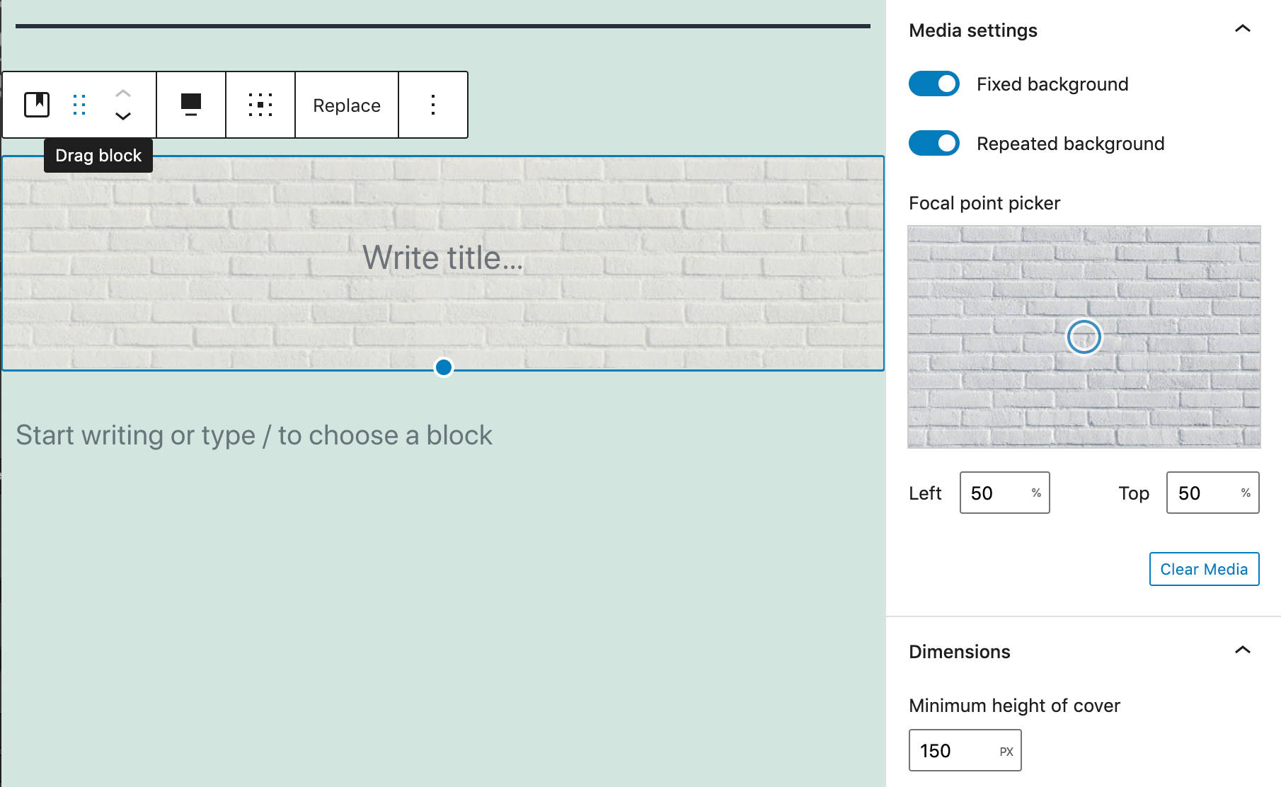
Position Controls for Videos in Cover Block
Added to Cover Blocks since Gutenberg 8.6, position controls for videos allow users to move the focal point around and set a custom position for videos. This functionality was previously available only for image backgrounds.
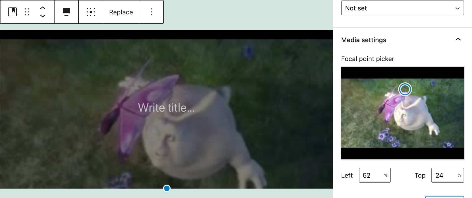
Video Position Controls for Cover Block
Position values are set by clicking anywhere on the focal point picker and/or using arrow keys on your keyboard. You can jump values by 10 by holding shift (see also #22531).
Block Pattern Updates
WordPress 5.6 also includes several block pattern improvements added with Gutenberg 8.6.
The layout, text, and color of the Large header and paragraph has been updated (#23858)
The heading in Two columns of text has been moved out of the text block and placed above the columns (#23853)
The Quote pattern now includes an image on top and a separator at the bottom.
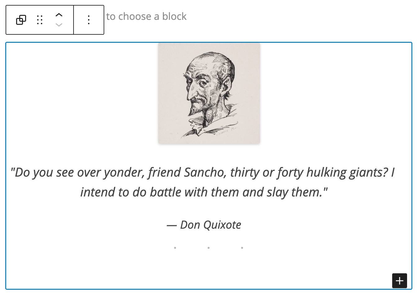
The new Quote pattern includes an image and a separator
A new Heading and paragraph pattern has been added with Gutenberg 8.7 (#24143).
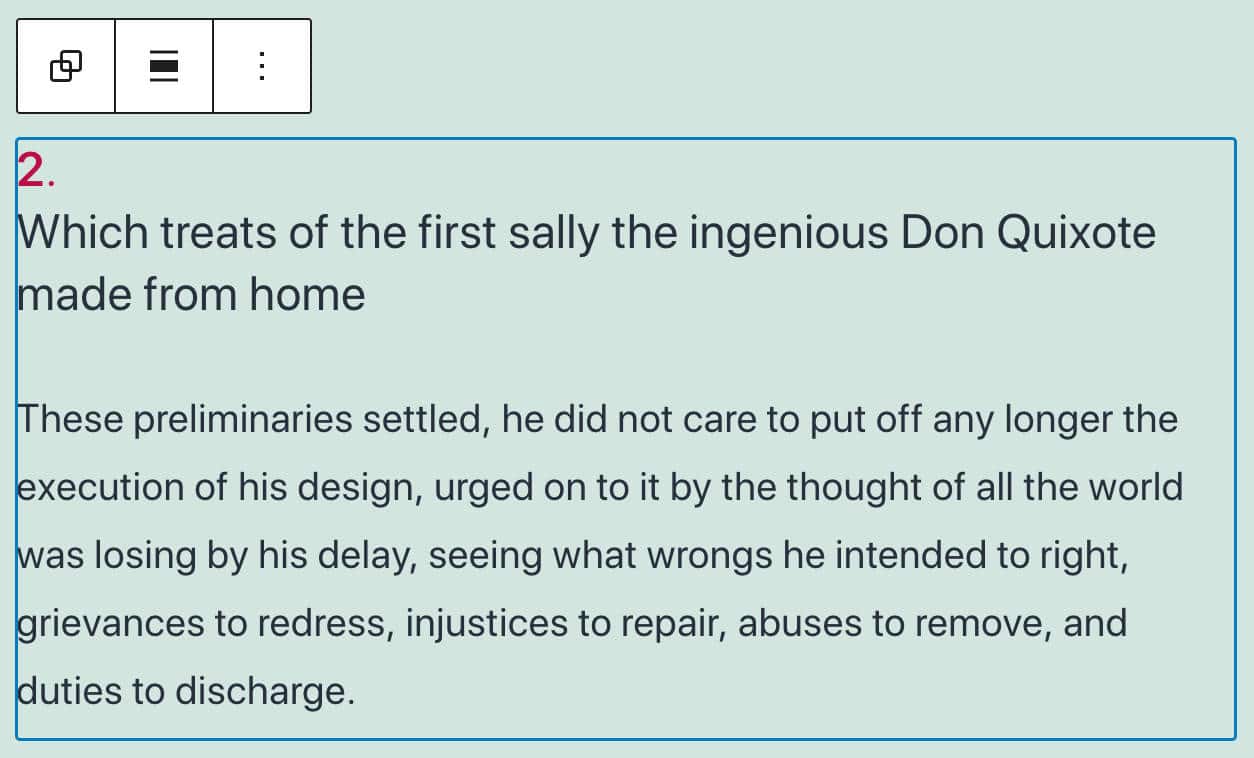
Heading and Paragraph pattern in WordPress 5.6
A good usability improvement for the block inserter is the block pattern category dropdown, which allows you to filter patterns by category. This is extremely useful when you have tons of patterns to choose from (#24954).
The block pattern category dropdown
Support for Video Subtitles
Video Blocks now support video subtitles.
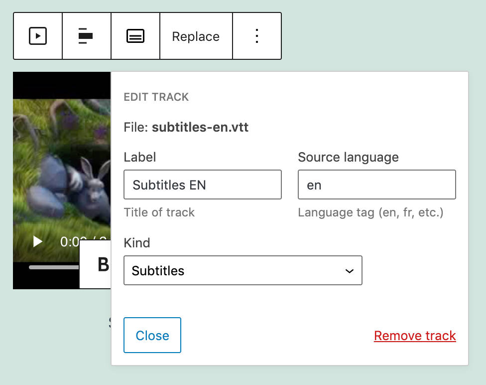
Adding video subtitles in Video Block
Editors and content creators should provide video subtitles in WebVTT format (Web Video Text Tracks Format), which is “a format for displaying timed text tracks (such as subtitles or captions) using the <track> element” (#25861).
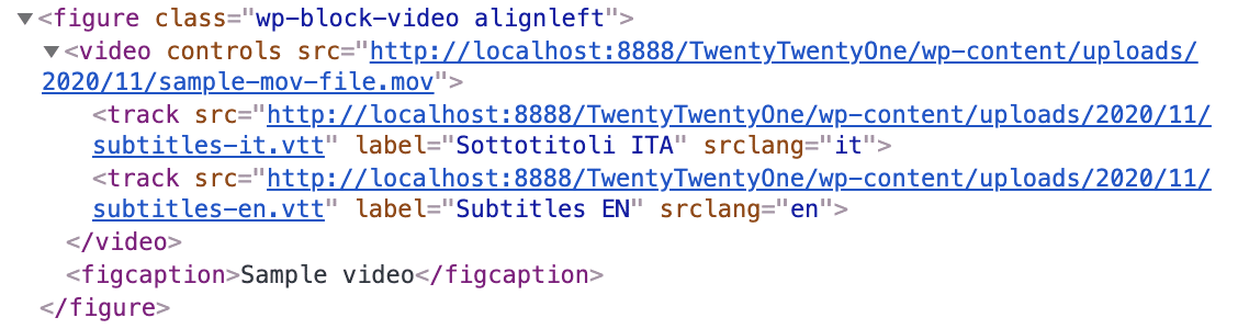
Track elements linking to subtitles in different languages
Once you have loaded your .vtt files, site viewers will be allowed to enable subtitles in their favorite language.
Transform Multiple Blocks into a Columns Block
An interesting usability improvement is the ability to convert multiple selected blocks into a Columns Block.
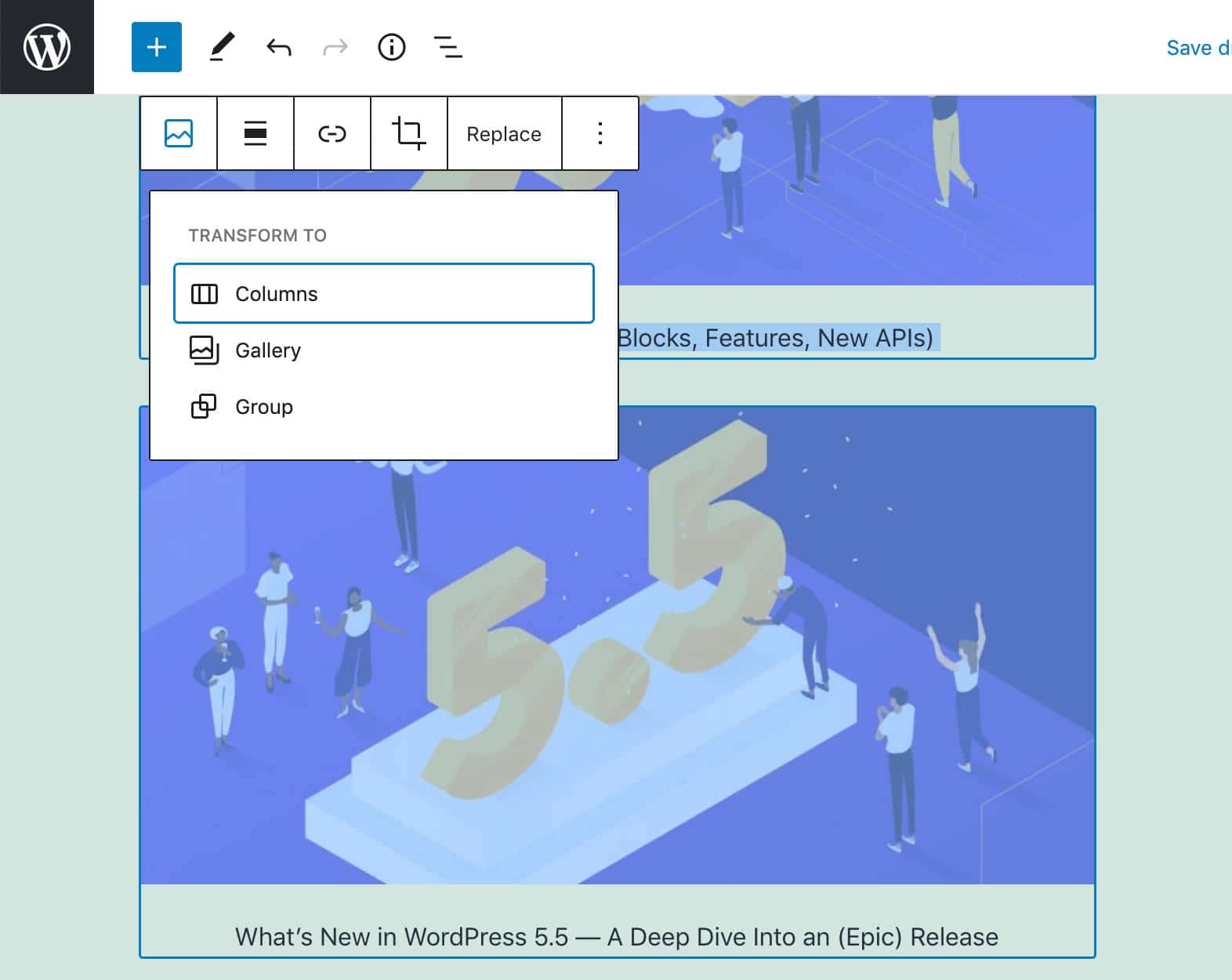
Select multiple blocks
You just need to select the blocks you want to show in columns, then click the upper right button of the block toolbar.
Each selected block will be converted into a column of a Columns Block.
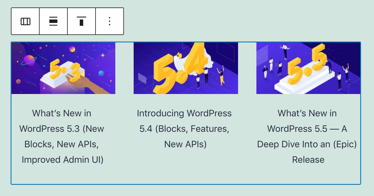
Three blocks converted into three columns
Background Patterns in Cover Block
Cover blocks can now display background patterns.
A cover block with a background pattern
To add a background pattern, upload a pattern image, then toggle on the Repeated background option (here’s everything you need to know about the Media Library in WordPress).
When done, adjust the focal point picker according to your needs and try different combinations with fixed backgrounds.
Image Size Control Added to the Media & Text Block
With Gutenberg 9.1, a new image size control has been added to images in Media & Text Block.
Users can now choose from all the available image sizes (#24795).
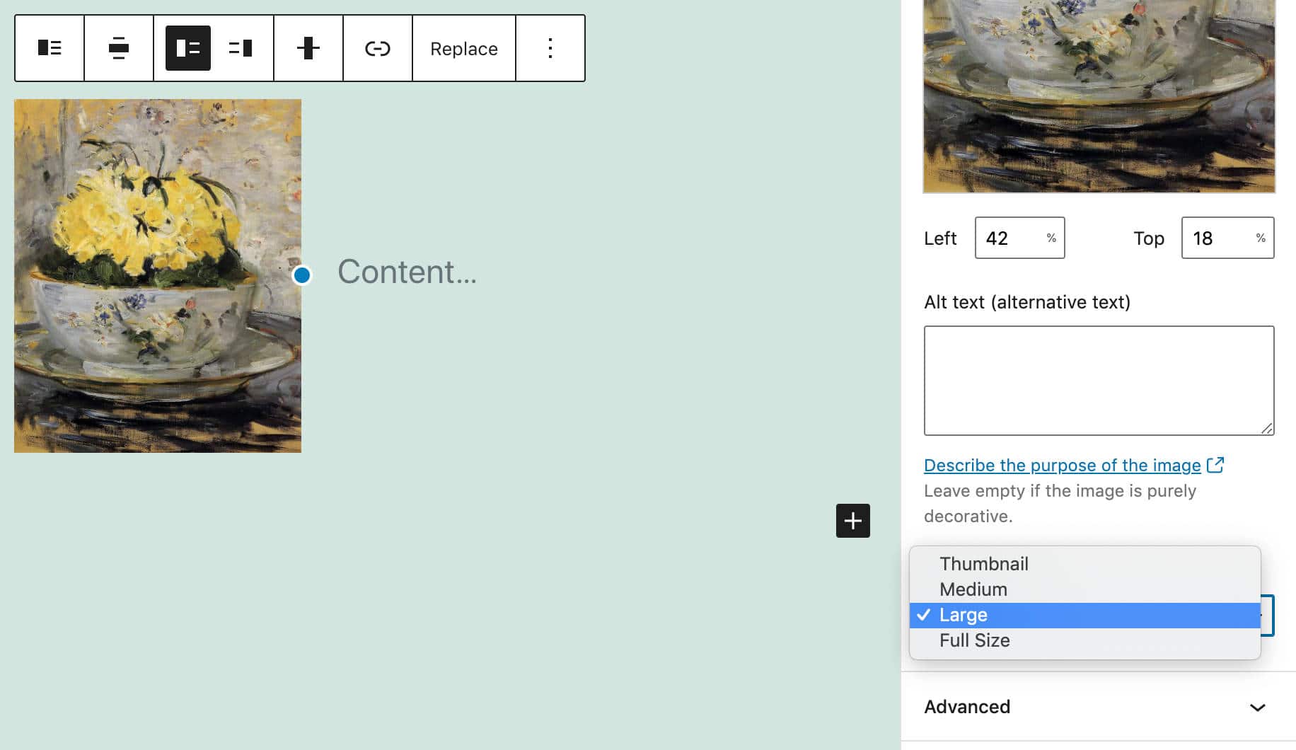
Image Size Control in Media & Text Block
Block API V2
A new Block API version enables blocks to render their wrapper element. The goal of the new API version is to lighten the editor’s DOM and make it match the front page content. According to Ella van Durpe:
The biggest benefit of this is that themes and plugins can more easily style the block content if the markup is the same in the editor.
The new version requires to declare the apiVersion property on block type registration:
registerBlockType( name, { apiVersion: 2 } );The new API also requires the useBlockProps hook in the block Edit function. This hook marks the wrapper element of a block as a block element.
Any property passed to this hook will be merged and returned to the wrapper element. The following example from the dev notes shows a simple use case:
import { useBlockProps } from '@wordpress/block-editor';

function Edit( { attributes } ) {
	const blockProps = useBlockProps( {
		className: someClassName,
		style: { color: 'blue' },
	} );
	return <p { ...blockProps }>{ attributes.content }</p>;
}
For more examples, see Block API version 2.
Additional Features and Improvements for Block Developers
Besides the Block API Version 2, here is a list of additions for developers to go through.
Block Supports API
Block Supports API allows block developers to add features to their blocks. Colors, backgrounds, font sizes are just a few of the many features that can be added to blocks through the Block Supports API.
WordPress 5.6 also introduces several new block supports “to increase consistency and make it easier to introduce these options into blocks”.
Developers can use the new block supports adding the corresponding keys to the supports property of the block.json file or directly into the registerBlockType function.
The following example from Block Supports dev note shows how it works:
supports: {
	color: {
		background: true, // Enable background color UI control.
		gradient: true, // Enable gradient color UI control.
		text: true // Enable text color UI control.
	},
	fontSize: true, // Enable font size UI control.
	lineHeight: true // Enable line height UI control.
}
The style value will be automatically attached to the wrapper element either through the has-<value>-<preset-category> class (for preset values) or with a style element (for custom values).
For this reason, Block Supports are intended to be used with the new Block API V2.
Block Supports can be used with dynamic blocks as well.
createBlocksFromInnerBlocksTemplate API
Developers can use the InnerBlocks component to create custom blocks containing other blocks. Examples are the Columns block and the Social Links block.
The new createBlocksFromInnerBlocksTemplate Block API allows you to create blocks from the InnerBlocks template.
See dev notes for a depper view and an example of code.
Toolbar Components
A couple of changes affect the Toolbar components as well:
1. ToolbarGroup Component
Before WordPress 5.6, the Toolbar component allowed developers to group related options in a common container. Now, a new ToolbarGroup component should be used instead.
<BlockControls>
	<ToolbarGroup>
		<ToolbarButton />
	</ToolbarGroup>
</BlockControls>
2. ToolbarButton and ToolbarItem Components
Using tabbable elements directly as toolbar items (i.e. <button>) has been deprecated. Aiming to improve accessibility, toolbar items can be added using ToolbarButton for buttons and ToolbarItem for other controls. The example below shows a button and a dropdown menu:
<BlockControls>
	<ToolbarItem as="button" />
	<ToolbarButton />
	<ToolbarItem>
		{ ( itemProps ) => ( <DropdownMenu toggleProps={ itemProps } /> ) }
	</ToolbarItem>
</BlockControls>
Disabling Core Block Patterns
Core patterns can now be disabled using the core-block-patterns support flag (#24042)
Disabling Inline Image Editor
Gutenberg 8.4 added an Inline Image Editing feature allowing users to edit images directly from the Block Editor.
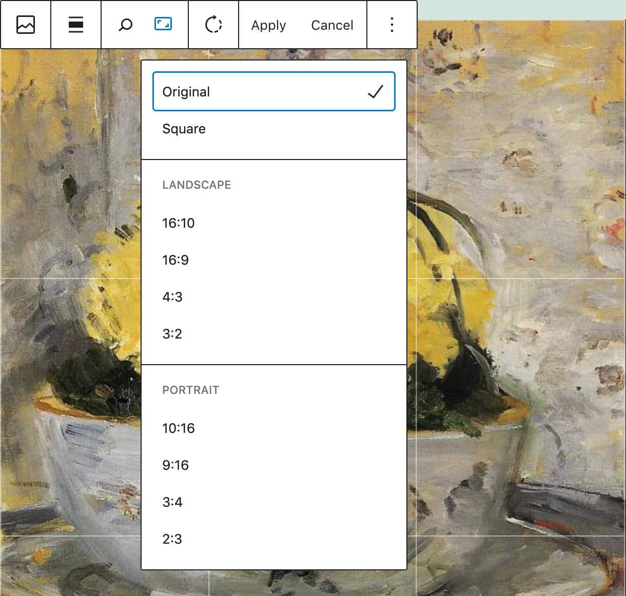
Inline Image Editing
Developers can now disable the Image Editor using the block_editor_settings filter (#23966):
add_filter( 'block_editor_settings', function( $settings ) {
	$settings['imageEditing'] = false;
	return $settings;
} );
Inline Image Editing disabled
Reusable Blocks Moved to a Separate Package
Reusable blocks, previously part of the @wordpress/editor package, have been moved to the @wordpress/reusable-blocks package to make them available in other editors.
Auto-Updates for Major Releases
Automatic updates are a core feature introduced in WordPress 3.7 aiming at improving site security and make it easier for site admins to maintain their WordPress websites up-to-date.
While automatic minor core updates have been implemented in earlier versions, with WordPress 5.6 site administrators can now manually enable automatic updates for major releases as well (more on that in a second).
Unfortunately, this crucial maintenance task might still be a little confusing for non-techy users. You can read more about how automatic updates work in our Deep Dive Into WordPress Automatic Updates blog post.
So, WordPress 5.6 introduces a new interface that allows site admins to enable auto-updates for major core releases.
The scope of this feature changed during WordPress 5.6 beta cycle and the original dev note has been replaced. In the words of Jb Audras,
The initial scope of Core auto-updates has moved to:
- Provide some updates to the design of the UI.
- For existing installations, the behavior will remain the same as it is today: opted-in to minor updates by default, but a user must opt-in to major updates (constants and filters that are already in use by hosts or agencies will still take precedence).
- For new installations, the default behavior will change: opted-in to minor updates by default and opted-in to major updates by default.
Starting with WordPress 5.6, you can opt-in to automatic updates for major core versions in the Updates screen, where a new UI provides a checkbox allowing you to Enable automatic updates for all new versions of WordPress.
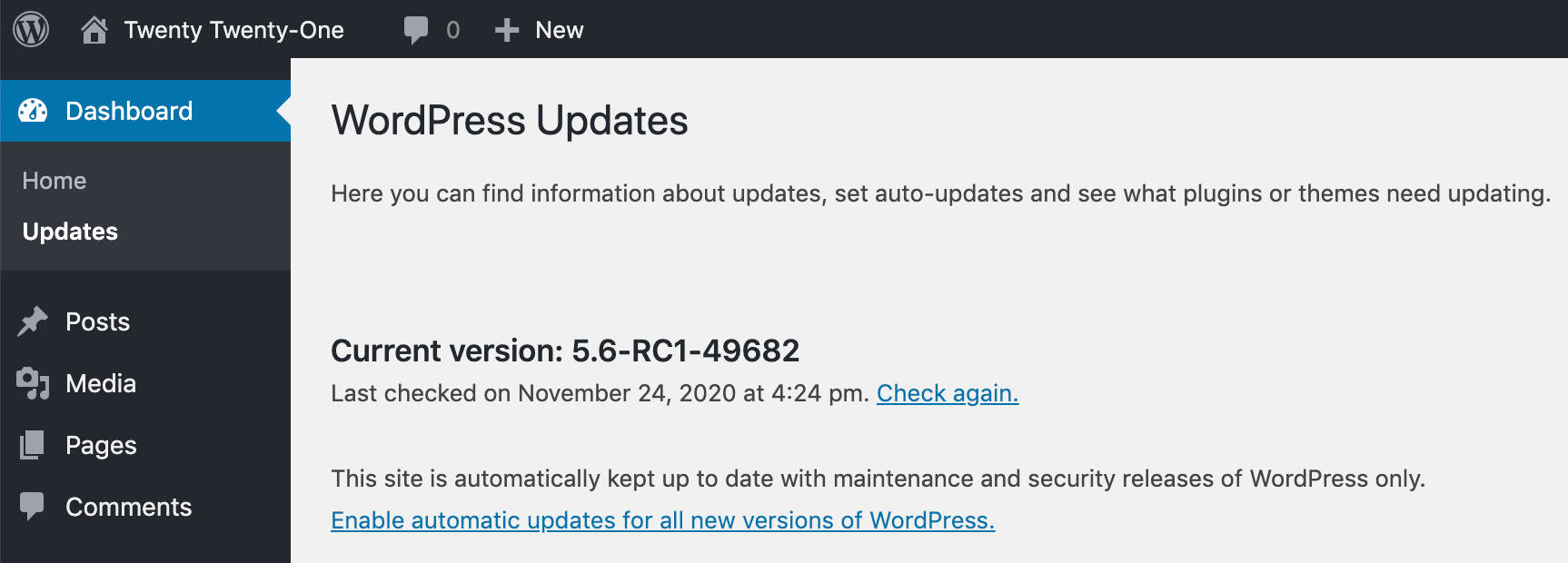
Enable automatic updates for all new versions of WordPress
Once you have enabled core auto-updates for major releases, you can then enable them to trigger for maintenance and security only by clicking on Switch to automatic updates for maintenance and security releases only.
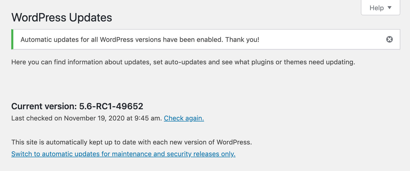
Switch to automatic updates for maintenance and security releases only
Major Automatic Core Updates for Developers
First, when major core automatic updates are enabled, the auto_update_core_major option is stored in the database with the option_value enabled. So, if get_site_option( 'auto_update_core_major' ) returns true, the automatic updates checkbox is checked.
Then WordPress checks if major core auto-updates are enabled through the WP_AUTO_UPDATE_CORE constant or allow_major_auto_core_updates filter and sets the checkbox accordingly.
Developers can also disable major core auto-updates by setting the WP_AUTO_UPDATE_CORE constant to false or minor as shown below (see also Controlling Background Updates Through wp-config.php):
# Disables all core updates:
define( 'WP_AUTO_UPDATE_CORE', false );

# Enables minor updates:
define( 'WP_AUTO_UPDATE_CORE', 'minor' );
Note that possible values for WP_AUTO_UPDATE_CORE are true (all), 'beta', 'rc', 'minor', false.
Another option to disable major core auto-updates by default is using the new allow_major_auto_core_updates filter:
add_filter( 'allow_major_auto_core_updates', '_return_false' );


 Hello, my name is Jack Sparrow. I'm a 50 year old self-employed Pirate from the Caribbean.
No comments:
Post a Comment