
Javascript - Learn Alpine.JS Modal Show and Hide / Focus on elements
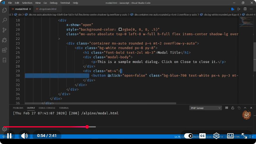
Mastering Alpine.js: Creating Modals with Show/Hide Functionality
In the fast-paced world of web development, having a toolkit that allows you to quickly implement user interface components is invaluable. One such toolkit is Alpine.js, a lightweight JavaScript framework that enables developers to create interactive web applications with minimal effort. In this tutorial, we will focus on how to create a modal dialog using Alpine.js, complete with show/hide functionality and element focus control.
What is Alpine.js?
Alpine.js is a minimal framework that provides reactive and declarative features similar to Vue.js but at a fraction of the size. It is particularly useful for adding interactivity to your HTML without the overhead of a full-fledged frontend framework. With Alpine.js, you can easily manage state and behavior directly in your markup.
Setting Up Your Environment
Before we dive into coding our modal, ensure you have Alpine.js included in your project. You can add it via a CDN link in the <head> section of your HTML document:
<!DOCTYPE html>
<html lang="en">
<head>
    <meta charset="UTF-8">
    <meta name="viewport" content="width=device-width, initial-scale=1.0">
    <title>Alpine.js Modal Example</title>
    <script src="https://cdn.jsdelivr.net/npm/alpinejs" defer></script>
    <link rel="stylesheet" href="styles.css"> <!-- Optional for styling -->
</head>
<body>
    <!-- Your content will go here -->
</body>
</html>
Creating the Modal Component
Next, we'll create a simple modal component that can be shown and hidden based on user actions. We'll also ensure that when the modal is opened, the focus is on the first input element.
HTML Structure
Here’s a basic setup for your modal:
<div x-data="{ open: false }">
<!-- Trigger Button -->
<button @click="open = true">Open Modal</button>
<!-- Modal -->
<div x-show="open" class="modal">
<div class="modal-content">
<span @click="open = false" class="close">×</span>
<h2>Modal Title</h2>
<input type="text" placeholder="Type here..." x-ref="inputField">
<button @click="open = false">Close</button>
</div>
</div>
</div>
Explanation of the Code
x-data="{ open: false }": This initializes a component state with a propertyopenset tofalse, indicating that the modal is initially hidden.@click="open = true": This directive is attached to the button that opens the modal.x-show="open": This directive controls the visibility of the modal. It will only render the modal ifopenistrue.@click="open = false": This directive is used to close the modal when the close button is clicked.x-ref="inputField": This is a reference to the input field that we will focus on when the modal opens.
Styling the Modal
You can add some basic CSS to style your modal to ensure it looks good on the screen:
.modal {
    display: flex;
    justify-content: center;
    align-items: center;
    position: fixed;
    top: 0;
    left: 0;
    width: 100%;
    height: 100%;
    background-color: rgba(0, 0, 0, 0.5);
}

.modal-content {
    background: white;
    padding: 20px;
    border-radius: 5px;
    position: relative;
}

.close {
    position: absolute;
    top: 10px;
    right: 15px;
    cursor: pointer;
}
Focusing on Elements
To enhance user experience, we want to set focus on the input field when the modal opens. We can achieve this by using the x-init directive:
<!-- Modal -->
<div x-show="open" x-init="$refs.inputField.focus()" class="modal">
Full Example
Here’s the complete code with all enhancements:
<!DOCTYPE html>
<html lang="en">
<head>
<meta charset="UTF-8">
<meta name="viewport" content="width=device-width, initial-scale=1.0">
<title>Alpine.js Modal Example</title>
<script src="https://cdn.jsdelivr.net/npm/alpinejs" defer></script>
<link rel="stylesheet" href="styles.css"> <!-- Optional for styling -->
<style>
/* CSS Styles Here */
.modal {
display: flex;
justify-content: center;
align-items: center;
position: fixed;
top: 0;
left: 0;
width: 100%;
height: 100%;
background-color: rgba(0, 0, 0, 0.5);
}
.modal-content {
background: white;
padding: 20px;
border-radius: 5px;
position: relative;
}
.close {
position: absolute;
top: 10px;
right: 15px;
cursor: pointer;
}
</style>
</head>
<body>
<div x-data="{ open: false }">
<button @click="open = true">Open Modal</button>
<div x-show="open" x-init="$refs.inputField.focus()" class="modal">
<div class="modal-content">
<span @click="open = false" class="close">×</span>
<h2>Modal Title</h2>
<input type="text" placeholder="Type here..." x-ref="inputField">
<button @click="open = false">Close</button>
</div>
</div>
</div>
</body>
</html>
Conclusion
In this tutorial, we've explored how to create a simple modal using Alpine.js with show/hide functionality and focus control on an input element. This pattern can be easily adapted and expanded for various use cases in your web applications. With Alpine.js, you can build interactive components efficiently while keeping your code clean and easy to maintain. Happy coding!
Connect with SkillBakery Studios
Explore more tutorials, tools, and resources:
Posted by SkillBakery Studios


 Hello, my name is Jack Sparrow. I'm a 50 year old self-employed Pirate from the Caribbean.
No comments:
Post a Comment