
Javascript - Learn AlpineJS Toggle Dropdown
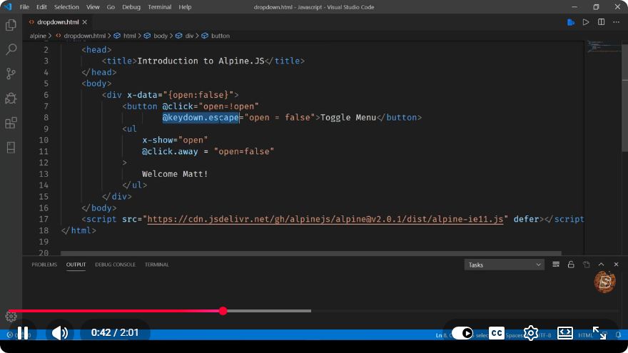
Mastering AlpineJS: Creating a Toggle Dropdown in Just 2 Minutes
AlpineJS is a lightweight JavaScript framework that offers a simple way to add interactivity to your web applications. In this tutorial, we’ll learn how to create a toggle dropdown using AlpineJS in just a couple of minutes.
What is AlpineJS?
AlpineJS is designed for developers who want the power of Vue.js or React without the overhead of a larger framework. It allows you to add reactivity and declarative behavior to your HTML with minimal effort. The syntax is straightforward, making it ideal for simple dynamic components like dropdowns, modals, and more.
Prerequisites
Before we get started, ensure you have the following:
- Basic knowledge of HTML and JavaScript.
- A code editor (e.g., VSCode, Sublime Text).
- A web browser to test your code.
Setting Up AlpineJS
To use AlpineJS, we first need to include the library in our HTML file. You can either download it or link to a CDN. For simplicity, we'll use the CDN link.
Step 1: Include AlpineJS in Your HTML
Create an HTML file and include the following code snippet in the <head> section:
<!DOCTYPE html>
<html lang="en">
<head>
    <meta charset="UTF-8">
    <meta name="viewport" content="width=device-width, initial-scale=1.0">
    <title>AlpineJS Toggle Dropdown</title>
    <script src="https://cdn.jsdelivr.net/npm/alpinejs@3.x.x/dist/cdn.min.js" defer></script>
    <style>
        /* Basic styling for dropdown */
        .dropdown {
            position: relative;
            display: inline-block;
        }
        .dropdown-content {
            display: none;
            position: absolute;
            background-color: #f9f9f9;
            min-width: 160px;
            box-shadow: 0px 8px 16px 0px rgba(0,0,0,0.2);
            z-index: 1;
        }
        .dropdown-content a {
            color: black;
            padding: 12px 16px;
            text-decoration: none;
            display: block;
        }
        .dropdown-content a:hover {
            background-color: #f1f1f1;
        }
    </style>
</head>
<body>
    <!-- Dropdown will go here -->
</body>
</html>
Step 2: Create the Dropdown Component
Now, let’s create the dropdown component using AlpineJS. Inside the <body> tag, add the following code:
<div x-data="{ open: false }" class="dropdown">
    <button @click="open = !open">Toggle Dropdown</button>
    <div x-show="open" @click.away="open = false" class="dropdown-content">
        <a href="#">Link 1</a>
        <a href="#">Link 2</a>
        <a href="#">Link 3</a>
    </div>
</div>
Explanation of the Code
x-data: This directive initializes a new AlpineJS component with a local state variable
openset tofalse. This variable will control the visibility of our dropdown.@click: The button has an event listener that toggles the
openstate betweentrueandfalsewhen clicked.x-show: This directive conditionally renders the dropdown content based on the value of
open. Whenopenistrue, the dropdown will be displayed.@click.away: This directive listens for clicks outside the dropdown and sets
opentofalse, effectively closing the dropdown when a user clicks outside of it.
Final Touch: Testing Your Dropdown
After adding the above code, your complete HTML file should look like this:
<!DOCTYPE html>
<html lang="en">
<head>
    <meta charset="UTF-8">
    <meta name="viewport" content="width=device-width, initial-scale=1.0">
    <title>AlpineJS Toggle Dropdown</title>
    <script src="https://cdn.jsdelivr.net/npm/alpinejs@3.x.x/dist/cdn.min.js" defer></script>
    <style>
        /* Basic styling for dropdown */
        .dropdown {
            position: relative;
            display: inline-block;
        }
        .dropdown-content {
            display: none;
            position: absolute;
            background-color: #f9f9f9;
            min-width: 160px;
            box-shadow: 0px 8px 16px 0px rgba(0,0,0,0.2);
            z-index: 1;
        }
        .dropdown-content a {
            color: black;
            padding: 12px 16px;
            text-decoration: none;
            display: block;
        }
        .dropdown-content a:hover {
            background-color: #f1f1f1;
        }
    </style>
</head>
<body>
    <div x-data="{ open: false }" class="dropdown">
        <button @click="open = !open">Toggle Dropdown</button>
        <div x-show="open" @click.away="open = false" class="dropdown-content">
            <a href="#">Link 1</a>
            <a href="#">Link 2</a>
            <a href="#">Link 3</a>
        </div>
    </div>
</body>
</html>
Conclusion
Congratulations! You have successfully created a toggle dropdown using AlpineJS in just a few minutes. This is just the tip of the iceberg when it comes to what you can do with AlpineJS. Experiment with additional features, such as animations and transitions, to make your dropdown even more interactive.
Feel free to explore the AlpineJS documentation for more advanced features and components. Happy coding!
Connect with SkillBakery Studios
Explore more tutorials, tools, and resources:
Posted by SkillBakery Studios


 Hello, my name is Jack Sparrow. I'm a 50 year old self-employed Pirate from the Caribbean.
No comments:
Post a Comment