
Javascript - Learn AlpineJS - Working with Tab components
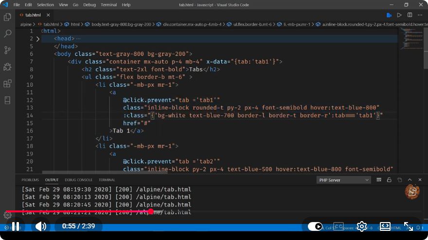
Mastering Alpine.js: Creating Tab Components in Under 3 Minutes
In the ever-evolving world of web development, JavaScript frameworks and libraries are essential tools for building interactive user interfaces. One such lightweight framework is Alpine.js, which provides a simple way to add interactivity to your websites without the overhead of larger frameworks like React or Vue. In this tutorial, we will focus on creating tab components using Alpine.js, a common UI pattern that enhances user experience.
What is Alpine.js?
Alpine.js is a minimal framework designed for developers who want to add interactivity to their applications without a heavy setup. It utilizes a declarative syntax similar to Vue.js, making it easy to learn and integrate with your existing HTML.
Getting Started with Alpine.js
Before we dive into creating tab components, you need to include Alpine.js in your project. You can add it via a CDN link in your HTML file:
<!DOCTYPE html>
<html lang="en">
<head>
    <meta charset="UTF-8">
    <meta name="viewport" content="width=device-width, initial-scale=1.0">
    <title>Alpine.js Tab Example</title>
    <script src="https://cdn.jsdelivr.net/npm/alpinejs@3.x.x/dist/cdn.min.js" defer></script>
</head>
<body>
    <!-- Tab Component Will Go Here -->
</body>
</html>
Creating a Tab Component
Now, let's create a simple tab component using Alpine.js. This component will contain two tabs, "Tab 1" and "Tab 2", each displaying different content.
Step 1: HTML Structure
We start by creating the basic HTML structure for our tabs. Here’s how we can set it up:
<div x-data="{ openTab: 1 }">
    <div class="tabs">
        <button
            :class="{ 'active': openTab === 1 }"
            @click="openTab = 1">Tab 1</button>
        <button
            :class="{ 'active': openTab === 2 }"
            @click="openTab = 2">Tab 2</button>
    </div>

    <div class="tab-content">
        <div x-show="openTab === 1">
            <h2>Content for Tab 1</h2>
            <p>This is the content displayed when Tab 1 is active.</p>
        </div>
        <div x-show="openTab === 2">
            <h2>Content for Tab 2</h2>
            <p>This is the content displayed when Tab 2 is active.</p>
        </div>
    </div>
</div>
Step 2: Adding Styles
Next, we can add some basic CSS to improve the appearance of our tab component:
.tabs {
    display: flex;
    margin-bottom: 1rem;
}

.tabs button {
    padding: 10px 20px;
    border: none;
    background-color: #f0f0f0;
    cursor: pointer;
    transition: background-color 0.3s;
}

.tabs button.active {
    background-color: #007bff;
    color: white;
}

.tab-content {
    border: 1px solid #ccc;
    padding: 1rem;
}
Step 3: Bringing It All Together
Here’s the complete code for your HTML file, including the tab component and styles:
<!DOCTYPE html>
<html lang="en">
<head>
    <meta charset="UTF-8">
    <meta name="viewport" content="width=device-width, initial-scale=1.0">
    <title>Alpine.js Tab Example</title>
    <script src="https://cdn.jsdelivr.net/npm/alpinejs@3.x.x/dist/cdn.min.js" defer></script>
    <style>
        .tabs {
            display: flex;
            margin-bottom: 1rem;
        }
        .tabs button {
            padding: 10px 20px;
            border: none;
            background-color: #f0f0f0;
            cursor: pointer;
            transition: background-color 0.3s;
        }
        .tabs button.active {
            background-color: #007bff;
            color: white;
        }
        .tab-content {
            border: 1px solid #ccc;
            padding: 1rem;
        }
    </style>
</head>
<body>
    <div x-data="{ openTab: 1 }">
        <div class="tabs">
            <button
                :class="{ 'active': openTab === 1 }"
                @click="openTab = 1">Tab 1</button>
            <button
                :class="{ 'active': openTab === 2 }"
                @click="openTab = 2">Tab 2</button>
        </div>

        <div class="tab-content">
            <div x-show="openTab === 1">
                <h2>Content for Tab 1</h2>
                <p>This is the content displayed when Tab 1 is active.</p>
            </div>
            <div x-show="openTab === 2">
                <h2>Content for Tab 2</h2>
                <p>This is the content displayed when Tab 2 is active.</p>
            </div>
        </div>
    </div>
</body>
</html>
Conclusion
Congratulations! You have successfully created a tab component using Alpine.js in just a few minutes. This simple yet powerful framework allows you to add interactivity with minimal effort, making it a great choice for developers looking to enhance their web applications.
Feel free to expand on this example by adding more tabs, animations, or even different content types. The possibilities are endless with Alpine.js!
For more advanced features and best practices, check out the Alpine.js documentation.
Happy coding!
Connect with SkillBakery Studios
Explore more tutorials, tools, and resources:
Posted by SkillBakery Studios


 Hello, my name is Jack Sparrow. I'm a 50 year old self-employed Pirate from the Caribbean.
No comments:
Post a Comment