
Vue.js 101 : Creating Dynamic and Versatile Vue.js Components
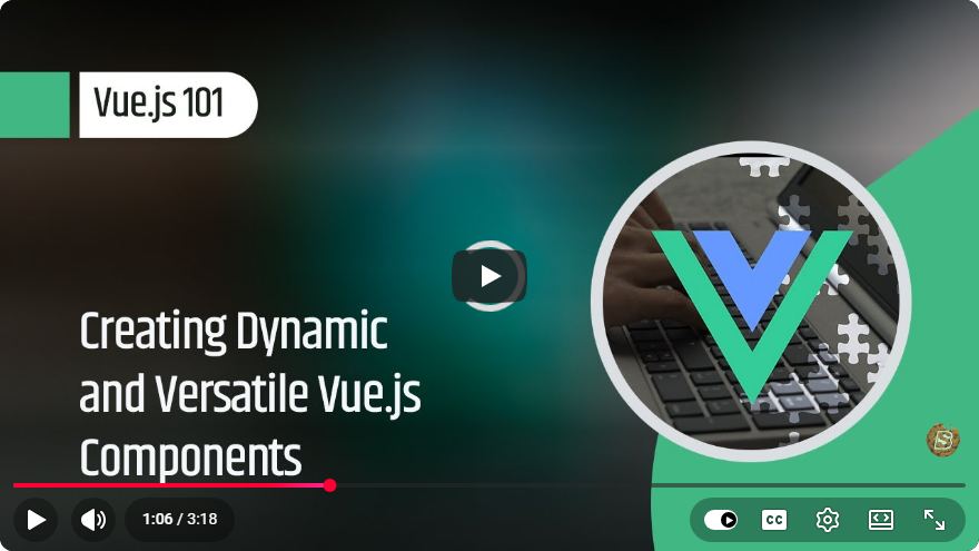
Vue.js 101: Creating Dynamic and Versatile Vue.js Components
In the world of modern web development, frameworks like Vue.js help streamline the creation of interactive user interfaces. One of the most powerful features of Vue.js is its component-based architecture, which allows developers to create reusable and dynamic components. In this blog post, we’ll explore how to create such components, making our applications more modular and maintainable.
What are Vue.js Components?
Vue.js components are self-contained units of code that encapsulate HTML, CSS, and JavaScript. They can be reused throughout an application, making it easier to manage and scale. Components can receive data through props, emit events, and maintain their own state, allowing developers to build complex interfaces from simple building blocks.
Setting Up Your Vue.js Environment
Before diving into component creation, ensure you have Vue.js set up in your development environment. You can easily create a new Vue.js project using Vue CLI with the following command:
npm install -g @vue/cli
vue create my-vue-app
cd my-vue-app
npm run serve
This will create a new Vue.js project and start a local development server.
Creating Your First Component
Let’s create a simple Vue.js component. We will create a dynamic button component that changes its label based on user interaction.
Create a New Component File: Create a new file called
DynamicButton.vueinside thesrc/componentsdirectory.<template> <button @click="toggleLabel">{{ buttonLabel }}</button> </template> <script> export default { data() { return { buttonLabel: 'Click Me', }; }, methods: { toggleLabel() { this.buttonLabel = this.buttonLabel === 'Click Me' ? 'You Clicked Me!' : 'Click Me'; }, }, }; </script> <style scoped> button { padding: 10px 20px; font-size: 16px; cursor: pointer; } </style>In this code:
- The template section defines the HTML structure of our button.
- The data function initializes the component's state with a
buttonLabel. - The methods section contains the
toggleLabelfunction, which updates the label when the button is clicked. - The style section applies basic styling to the button.
Using the Component: Now, we need to use our
DynamicButtoncomponent in the mainApp.vuefile.<template> <div id="app"> <h1>Welcome to Vue.js!</h1> <DynamicButton /> </div> </template> <script> import DynamicButton from './components/DynamicButton.vue'; export default { components: { DynamicButton, }, }; </script> <style> #app { text-align: center; margin-top: 50px; } </style>Here, we import the
DynamicButtoncomponent and register it within thecomponentsobject. The component is then included in the template, allowing it to be rendered on the page.
Making It Dynamic with Props
To make our DynamicButton component more versatile, we can add props to customize its label from the parent component.
Modifying the Component
Update the DynamicButton.vue file to accept a prop for the button label:
<template>
  <button @click="toggleLabel">{{ buttonLabel }}</button>
</template>

<script>
export default {
  props: {
    initialLabel: {
      type: String,
      default: 'Click Me',
    },
  },
  data() {
    return {
      buttonLabel: this.initialLabel,
    };
  },
  methods: {
    toggleLabel() {
      this.buttonLabel = this.buttonLabel === this.initialLabel ? 'You Clicked Me!' : this.initialLabel;
    },
  },
};
</script>
In this updated version, we added a props section to define initialLabel. The component's state is initialized with the value of this prop.
Using the Prop
Now, we can modify the App.vue file to pass a custom label to the DynamicButton component:
<template>
  <div id="app">
    <h1>Welcome to Vue.js!</h1>
    <DynamicButton initialLabel="Press Here" />
  </div>
</template>
With this change, the button will now display "Press Here" as its initial label.
Conclusion
In this tutorial, we explored the basics of creating dynamic and versatile components in Vue.js. We started with a simple button component, then enhanced it by adding props to customize its behavior. This component-based approach not only promotes code reuse but also helps maintain a clean and organized codebase.
As you continue your journey with Vue.js, experiment with creating more complex components and explore Vue's powerful features to build dynamic applications. Happy coding!
Connect with SkillBakery Studios
Explore more tutorials, tools, and resources:
Posted by SkillBakery Studios


 Hello, my name is Jack Sparrow. I'm a 50 year old self-employed Pirate from the Caribbean.
No comments:
Post a Comment