
Web Designers : Decoding the Alignment of Flexbox Children
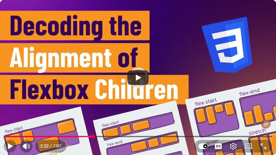
Understanding Flexbox Alignment for Web Designers
Flexbox, or the Flexible Box Layout, is a powerful CSS layout module that allows web designers to create responsive and efficient layouts. One of the core features of Flexbox is its ability to align children elements within a container. In this blog post, we will decode the alignment options available to Flexbox children, equipping you with the knowledge to utilize these features effectively in your web designs.
What is Flexbox?
Flexbox is a layout model that provides an easy and efficient way to arrange elements within a container. It allows for flexible sizing, distribution of space, and alignment of items, all without the need for complex CSS floats or positioning.
Key Flexbox Terminology
Before diving into alignment, let’s clarify some key terms:
- Flex Container: The parent element that holds the flex items. It is defined by setting the
displayproperty toflexorinline-flex. - Flex Items: The child elements of a flex container that will be aligned and arranged according to the flexbox properties.
Setting Up a Flexbox Container
To start using Flexbox, you first need to create a flex container. Here’s a simple example:
<div class="flex-container">
    <div class="flex-item">Item 1</div>
    <div class="flex-item">Item 2</div>
    <div class="flex-item">Item 3</div>
</div>
.flex-container {
    display: flex;
}
.flex-item {
    padding: 10px;
    border: 1px solid #000;
}
Alignment Properties
1. Aligning Items Horizontally
To align the flex items along the main axis (which is horizontal by default), you can use the justify-content property. Here are the different values you can use:
- flex-start: Aligns items to the start of the flex container.
- flex-end: Aligns items to the end of the flex container.
- center: Centers items within the flex container.
- space-between: Distributes space between items, with no space at the start or end.
- space-around: Distributes space around items, with equal space around each item.
Example
.flex-container {
    display: flex;
    justify-content: space-between; /* Try changing this to center, flex-start, etc. */
}
2. Aligning Items Vertically
To align flex items along the cross axis (vertical alignment), use the align-items property:
- flex-start: Aligns items to the top of the flex container.
- flex-end: Aligns items to the bottom of the flex container.
- center: Centers items vertically within the container.
- baseline: Aligns items along their baseline.
- stretch: Stretches items to fill the container (default value).
Example
.flex-container {
    display: flex;
    align-items: center; /* Try changing this to flex-start, flex-end, etc. */
}
3. Aligning Individual Items
Sometimes, you might want to align individual flex items differently. For this, you can use the align-self property directly on the flex item:
.flex-item:nth-child(1) {
    align-self: flex-end; /* Overrides the container's align-items property */
}
Combining Alignment Properties
You can combine both justify-content and align-items to achieve complex layouts. For example, if you want to center items both horizontally and vertically:
.flex-container {
    display: flex;
    justify-content: center;
    align-items: center;
    height: 100vh; /* Make the container full height to see vertical centering */
}
Practical Example
Here’s a complete example demonstrating various alignment techniques in a Flexbox layout:
<div class="flex-container">
    <div class="flex-item">Item 1</div>
    <div class="flex-item">Item 2</div>
    <div class="flex-item">Item 3</div>
</div>
.flex-container {
    display: flex;
    justify-content: space-around; /* Change this value for different horizontal alignment */
    align-items: center; /* Change this value for different vertical alignment */
    height: 100vh;
    background-color: #f0f0f0;
}

.flex-item {
    padding: 20px;
    background-color: #007BFF;
    color: white;
    border-radius: 5px;
}
Conclusion
Flexbox is a versatile tool for web designers, allowing for intuitive and flexible layouts. Understanding how to align flex items using the properties justify-content, align-items, and align-self can significantly enhance your web design skills.
Experiment with the different alignment properties in your projects, and you’ll soon find that Flexbox can make your layouts not only responsive but also aesthetically pleasing.
For a deeper dive into Flexbox alignment, be sure to check out the original video. Happy designing!
Connect with SkillBakery Studios
Explore more tutorials, tools, and resources:
Posted by SkillBakery Studios


 Hello, my name is Jack Sparrow. I'm a 50 year old self-employed Pirate from the Caribbean.
No comments:
Post a Comment