
Web Designers : Learn rearranging flexbox children by utilizing the order property.
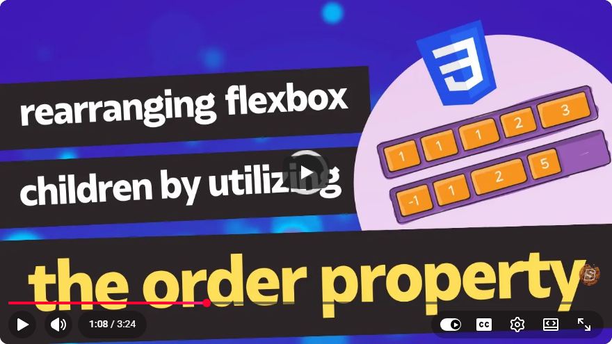
Rearranging Flexbox Children with the Order Property
Flexbox is a powerful layout model in CSS that allows for more efficient and dynamic arrangement of elements within a container. One of the key features of Flexbox is the order property, which provides a simple way to rearrange flex items without changing the underlying HTML structure. In this blog post, we'll explore how to utilize the order property to rearrange flexbox children effectively.
What is Flexbox?
Flexbox, or the Flexible Box Layout, is a CSS layout mode designed to give you more control over the alignment, direction, and size of items in a container. It allows for responsive designs that adapt to different screen sizes and orientations. The main advantages of using Flexbox include:
- Ease of alignment
- Distribution of space
- Ability to reorder items dynamically
Understanding the Order Property
The order property is a CSS property applied to flex items that determines the order in which they appear within the flex container. By default, all flex items have an order value of 0. Items with a lower order number will appear before items with a higher order number.
Syntax of the Order Property
.item {
    order: <integer>;
}
You can assign any integer value to the order property, including negative values. The layout will adjust automatically based on these values.
Example: Rearranging Flexbox Children
Let’s create a simple example to illustrate how the order property works. Below is a code snippet that demonstrates how to rearrange items in a flex container.
HTML Structure
<div class="flex-container">
    <div class="item item1">Item 1</div>
    <div class="item item2">Item 2</div>
    <div class="item item3">Item 3</div>
    <div class="item item4">Item 4</div>
</div>
CSS Styles
.flex-container {
    display: flex;
    justify-content: space-around;
    padding: 20px;
    background-color: #f0f0f0;
}

.item {
    padding: 20px;
    background-color: #007BFF;
    color: white;
    border-radius: 5px;
    text-align: center;
}

/* Applying order to rearrange items */
.item1 {
    order: 3;
}

.item2 {
    order: 1;
}

.item3 {
    order: 4;
}

.item4 {
    order: 2;
}
Explanation of the Example
In the above example, we have a flex container with four items. The default order would display them as:
- Item 1
- Item 2
- Item 3
- Item 4
However, by applying the order property, we modify the display order to:
- Item 2 (order: 1)
- Item 4 (order: 2)
- Item 1 (order: 3)
- Item 3 (order: 4)
Visual Representation
When rendered in a browser, the items will appear in the following order:
- Item 2
- Item 4
- Item 1
- Item 3
Practical Use Cases for the Order Property
The order property can be especially useful in various scenarios:
- Responsive Designs: You can rearrange elements based on screen size using media queries.
- Dynamic Content: For applications that allow users to change the order of items (like to-do lists), the
orderproperty provides a simple way to implement this feature. - UI Enhancements: It allows designers to create visually appealing layouts without altering the HTML structure, making it easier to maintain and manage.
Conclusion
The order property in Flexbox is a powerful tool for web designers looking to create dynamic and responsive layouts. By understanding how to use the order property effectively, you can rearrange flexbox children with ease, enhancing the user experience of your web applications.
Feel free to experiment with different layouts and see how the order property can transform your designs! For further exploration, check out the CSS Tricks Guide to Flexbox.
Happy designing!
Connect with SkillBakery Studios
Explore more tutorials, tools, and resources:
Posted by SkillBakery Studios


 Hello, my name is Jack Sparrow. I'm a 50 year old self-employed Pirate from the Caribbean.
No comments:
Post a Comment