
Web Designers : Arranging content through the utilization of flex-direction
Mastering Flexbox: Arranging Content with Flex-Direction
In the realm of web design, flexibility is key. The CSS Flexbox layout model is a powerful tool that allows designers to create responsive layouts with ease. One of the core properties of Flexbox is flex-direction, which determines the direction in which the flex items are placed in the flex container. In this tutorial, we will explore how to effectively use flex-direction to arrange content, enhancing your web design skills.
What is Flexbox?
Flexbox, or the Flexible Box Layout, is a CSS layout model that provides an efficient way to arrange items within a container, even when their size is unknown or dynamic. The primary purpose of Flexbox is to allow space distribution between items in a container and to align content accordingly.
Understanding Flex-Direction
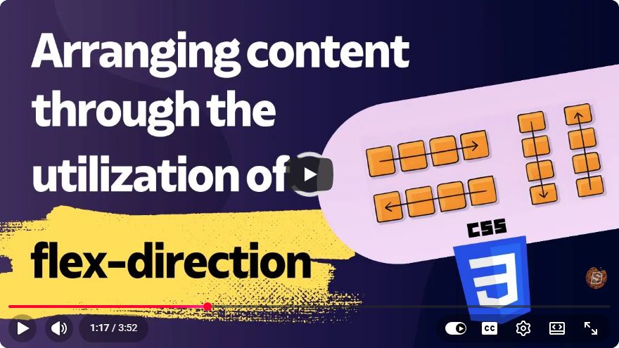
The flex-direction property defines how the flex items are placed in the flex container. There are four possible values for flex-direction:
- row: The default value. Items are placed from left to right.
- row-reverse: Items are placed from right to left.
- column: Items are placed from top to bottom.
- column-reverse: Items are placed from bottom to top.
Setting Up the Flex Container
To utilize flex-direction, you first need to set up a flex container. Here’s a simple example:
<!DOCTYPE html>
<html lang="en">
<head>
    <meta charset="UTF-8">
    <meta name="viewport" content="width=device-width, initial-scale=1.0">
    <title>Flexbox Example</title>
    <style>
        .flex-container {
            display: flex; /* Enable flexbox */
            height: 100px; /* Set height for visibility */
            border: 2px solid #ccc; /* Optional styling */
        }
        .flex-item {
            padding: 10px;
            border: 1px solid #000;
            margin: 5px;
        }
    </style>
</head>
<body>
    <div class="flex-container">
        <div class="flex-item">Item 1</div>
        <div class="flex-item">Item 2</div>
        <div class="flex-item">Item 3</div>
    </div>
</body>
</html>
Using Flex-Direction
Now that we have our flex container set up, let’s see how to change the flex-direction. Below are examples of each value:
1. Row (Default)
This is the default behavior. Items are arranged from left to right.
.flex-container {
    flex-direction: row; /* Default */
}
2. Row-Reverse
Items will be arranged from right to left.
.flex-container {
    flex-direction: row-reverse;
}
3. Column
Items will be arranged from top to bottom.
.flex-container {
    flex-direction: column;
}
4. Column-Reverse
Items will be arranged from bottom to top.
.flex-container {
    flex-direction: column-reverse;
}
Example Implementation
Here’s a complete example demonstrating how to implement different flex-direction values:
<!DOCTYPE html>
<html lang="en">
<head>
    <meta charset="UTF-8">
    <meta name="viewport" content="width=device-width, initial-scale=1.0">
    <title>Flexbox Direction Example</title>
    <style>
        .flex-container {
            display: flex;
            height: 200px;
            margin: 20px;
            border: 2px solid #ccc;
        }
        .flex-item {
            padding: 10px;
            border: 1px solid #000;
            margin: 5px;
        }

        /* Change this to see different flex-direction behaviors */
        .row { flex-direction: row; }
        .row-reverse { flex-direction: row-reverse; }
        .column { flex-direction: column; }
        .column-reverse { flex-direction: column-reverse; }
    </style>
</head>
<body>
    <div class="flex-container row">
        <div class="flex-item">Item 1</div>
        <div class="flex-item">Item 2</div>
        <div class="flex-item">Item 3</div>
    </div>

    <div class="flex-container column">
        <div class="flex-item">Item A</div>
        <div class="flex-item">Item B</div>
        <div class="flex-item">Item C</div>
    </div>
</body>
</html>
Conclusion
Understanding how to use flex-direction effectively can dramatically improve your web layouts. By mastering this property, you can arrange and align your content in a variety of ways, creating designs that are not only functional but also visually appealing.
As you experiment with Flexbox, remember to test your layouts in different screen sizes to ensure responsiveness. Happy designing!
Connect with SkillBakery Studios
Explore more tutorials, tools, and resources:
Posted by SkillBakery Studios


 Hello, my name is Jack Sparrow. I'm a 50 year old self-employed Pirate from the Caribbean.
No comments:
Post a Comment